Hello Creatives!
Designing for a cause, charity or non-profit is a different experience than a typical client; it pulls at the heart strings of the audience you are trying to reach through promotional materials, infographics and motion graphics/ animation.
Designing for a cause is meant to inform, be memorable and encourage a call-to-action through charitable giving.
Infographics
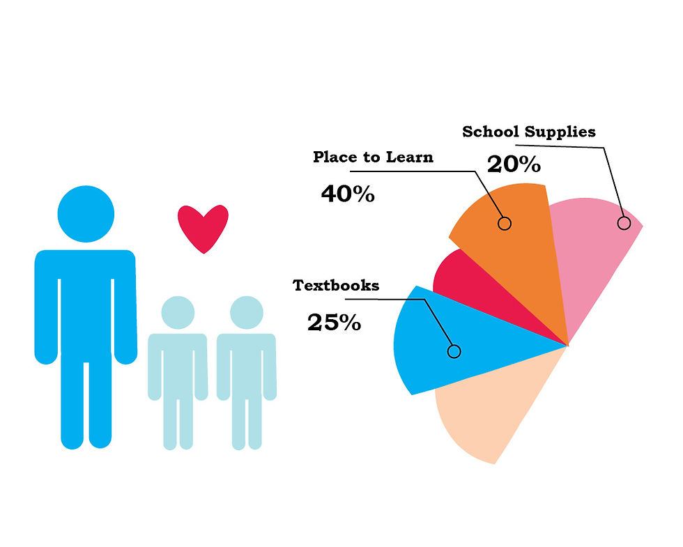
Infographics, or information graphics, are meant to convey a clear graphical representation of bulk information that is easy to understand. Designing for causes, charities and non-profits utilize these simple symbols to convey their messages in an attractive way. Designing for a cause relies on attracting attention and spreading an important message like the one below about donating supplies for children globally to have an education.
Infographics make bulk information more engaging to read rather than reading paragraphs of type on a page. In order to be effective, the infographics must be simple, easily recognizable and attractive to draw attention from the target audience. Negative space, color and balance are key when creating infographics. For the example below, you have what the charity is for, what is needed, where the supplies are going, and a call-to-action to give in various ways. There is also a graph showcasing how much the charity has raised.
Charitable Marketing
For a design to be successful, it has to convey a clear message to an audience. Designing for a cause has to allow the audience to feel they can give to something beneficial. In return for their generosity, it is common to gift the giver a product more commonly known as swag.
Swag bags or product giveaways and materials are a gift for the giver to encourage awareness and attract more of the target audience. More often than not, the audience will not be willing to be charitable or giving unless they recieve something in return. These items are meant to be a representation of appreciation. These promotional items can be designed simply, they do not have to be complex designs but they need to be useful to the recipient. For instance, if the fundraiser or charity is for education, like our example above, then the most common swag would be a notepad/notebook, folder/binder and totebag. The promotional items have to make sense with what is being marketed, even if it is for a cause, charity or non-profit.
Promotional items are also an encouragement for further call-to-action by the recipient spreading the message through word-of-mouth. If you are looking to expand your portfolio, try doing some work with non-profits and charities because you will benefit them and yourself with what you create.
See You Soon Creatives!